Transparent Layers
by Suzanne Ross
Patrick Baudisch likes to think ahead. He knows that in the
future we'll all be a lot more mobile than we already are.
That means we'll need tools to help us work on small devices
as we travel from place to place.
He has developed a novel way to display information on a
small screen.
"The moment you switch to a small screen device from a
large display, you need to think about how people can still
find their way around," said Baudisch.
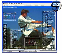
If you had a lot of papers on a small desk, you'd probably
stack them into piles. But you can't see through one paper to
the one below. That means that you may never again see the
papers on the bottom of the stack. Baudisch liked the stacking
idea, but he made some of the layers transparent, so that you
can see through the top layer to the one below. This works
especially well in programs that require floating palettes or
tools, such as image editing programs.
Other people have created translucent layers using a
process called alpha blending. Alpha blending merges a
translucent foreground with a background color to create an
in-between blend. However, alpha blending does not make it
easy to tell which object is in the foreground and which is in
the background. Users get confused trying to select various
objects. Sometimes text will blend, causing a C and a D to
merge into an O.
Baudisch calls his technique multiblending.
Multiblending uses multiple layers to make manipulating tools
or data on a small screen easier. Multiblending allows you to
see through all the layers on your screen. User studies showed
that multiblended palettes provided higher recognizability of
both the background and the palette than the best version of
alpha blending.
"With multiblending, we think about which features we
really care about instead of mixing everything together in the
same way. In the case of an image editing program, what we
really care about in our foreground is the edges of the tools,
and preserving color in the background image."
 For objects that are in the
foreground, and are less important, the colors removed, and
the edges are emphasized. "Then, whenever I see a crisp line,
I know it's in the foreground because we've blurred the
background. At the same time whenever I see a color I know
this is the true background color," said Baudisch.
For objects that are in the
foreground, and are less important, the colors removed, and
the edges are emphasized. "Then, whenever I see a crisp line,
I know it's in the foreground because we've blurred the
background. At the same time whenever I see a color I know
this is the true background color," said Baudisch.
"Multiblending switches from RGB to a perception oriented
color model. We use this because the human visual system is
better at separating out the individual channels.
The first step in multiblending is to eliminate irrelevant
color information. The color behind a tool palette isn't
important, so in this case the color would be removed by
desaturating. The luminance from the tool palette and the
background are then blended.
Icons are used frequently in tool palettes. They're very
simple images, and emphasizing the edges is the most important
for recognition. The process is similar to embossing.
Multiblending also eliminates background 'noise' and excess
icons or information that aren't needed, such as frequently
used areas that are well-known to the user. The resulting
palette is easy to read. One possible version of the resulting
top layer is a palette that looks like a glass overlay, though
this is just one example.
"On small screen devices you want to be able to use your
entire screen for the document you're looking at. You don't
want to have a trade off between the tools you need and your
document," concludes Baudisch.
